|
As social media progresses to become a major advocate for design communications, it is actually becoming harder and harder to determine a genuinely passionate insta-grammer that is seeking more than just followers. Incorporated in this list are studios, companies, practices, individuals of the design field and individuals who are just passionate in providing an inspirational feed to share with the Instagram community.
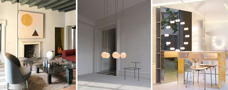
ONE DESIGNER AND HIS STUDIO TEAM | @studiodavidthulstrupStudio David Thulstup is an architecture, interior and design practice based in Copenhagen Denmark. Their feed projects their residential, retail, and installation work as well as day-to-day inspirations and design processes in the form of photographs and mood boards. @studiodavidthulstrup provides a rich and aesthetically pleasing feed that inspires spatial exploration, interior/exterior colour palettes, textures, and forms.
INNOVATORS OF COLOUR TECHNOLOGY | @resenecolourResene is a paint manufacturing company based in Australia and New Zealand. The company also provides a variety of interior decorations in pursuance of their vision to being recognized as ethical and sustainable innovators in paint and colour technology. In actuality their instagram feed is dramatically more than just paint products and wall decorations, but more so a projection of creative inspiration in the form of photographs. Bright and subtle colour palettes, delicate, smooth or textured, and countless varieties of colour use is exemplified in interiors through beautifully photographed spaces and concepts. This is for those who have a love and appreciation of colours, or maybe just in dire need of inspiration for plateaued projects. You can follow them on instragram at @resenecolour.
TEAM OF FURNITURE DESIGNERS | @prostoria@prostoria is a design brand based in Croatia, and their vision is to create upholstered furniture to enrich one’s interior experiences. Their Instagram feed shouts modern minimalism and sophisticated interior settings that range in variety from residential to retail and workplace. There is also a subtle presence of bright coloured furniture’s within neutral interior palettes, complimenting not only their furniture design but also its compatibility with the interior architecture and design. @prostoria is one of the many design feeds that are overlooked while users begin their aesthetic hunt with major international brands and celebrity instgrammers such as Martyn Lawrence Bullard and Kelly Weastler. Their feed does not merely brag of their projects and design processes, but also a creative projection of interiors, furniture, and colours for endless inspiration and motivation.
ONE DESIGNER AND HER COMPANY | @yellowtraceYellowtrace is well known as an influential online design publication with the Instagram feed curated by the founder of the company, Dana Tomic Hughes. Just as the profile suggests, this feed is to satiate the curious minds of all those passionate to the world of design. It provides constant updates of design inspiration amongst architecture, interior design, furniture design, art, and photography. @yellowtrace exposes their followers to interiors, exteriors, residential, retail, commercial, even exhibitions and lectures. This feed is perfect for those looking for inspirational direction upon all design and artistic professions, for those with an appetite for the aesthetically pleasing, and anyone who wishes to keep up to date with the creative world. The final touch is their thrifty descriptions of more than one moderate sentence, but less than those inadequate essays so common throughout Instagram.
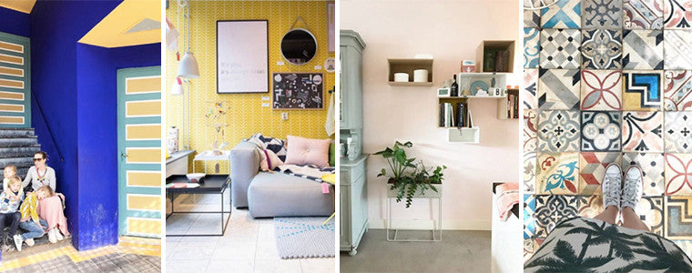
INSPIRED DESIGNER | @femkeidoFemke Dekker is an interior designer and stylist with preferential posting of soft colour palettes. Femke’s feed highlights simplicity in the portrayal of her design characteristics. It is consistent with bright and clear, perfectly cropped images providing the most prominent aspects of the depicted style. She provides her own work, studio work, her home, and design inspirations, varying from houses, practices, restaurants, hotels and businesses. Each tailor made design depicted on @femkeido proves her vision of balanced interiors with rich or subtle colour application.
DIY DESIGNER | @textured.living.interiorsErin is an interior stylist and DIY-er. Her Instagram feed has beautiful images of bright neutral colour palettes, preferential styles of whites and off whites combined with soft timbers and natural greens. She expresses a very nonchalant residential chic with the warmth of a home, and her photographs are unfailingly brightened with a sharp eye for projecting the essence of a space. @textured.living.interiors is perfect for followers who are in search for a designer that has the down to earth and everyday feel, with an interest in the more realistic and affordable but modern DIY looks.
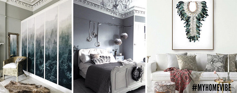
INSPIRED BLOGGER | @around_housesFiona Cameron is an interiors blogger with the perfect go to feed for a ‘Victorian meets the 21st century’ vibe. These are the kind of residential styling that is representational of a more conceivable design choice for your own home. A lovely aspect of @around_houses feed is the inclusion of its followers in #MYHOMEVIBE as the weekly inspirational display beyond Fiona’s own works and home style.
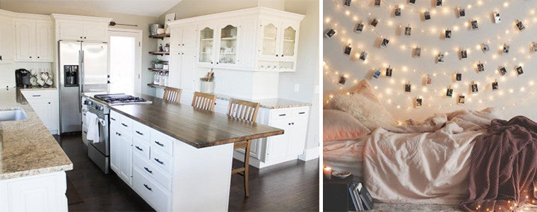
INSPIRED INDIVIDUAL | @interiormilkInterior milk has become a very popular design inspo’ page with almost 450k followers. A favourite aspect of the @interiormilk page is the diversity of residential interior styles, each with a different characteristic just as inspirational as the last. There is a strong presence of subtle to bright colour choices within light neutrals, whites and soft timber interiors. Her range of examples consist of modern lofts to cosily decorated kitchens, exposed brick bedrooms and brightly decorated walls, as well as beautifully framed attic rooms and bold coloured furnitures.
from https://www.wallvision.com.au/blogs/news/inspirational-interior-design-instagrams
18 Comments
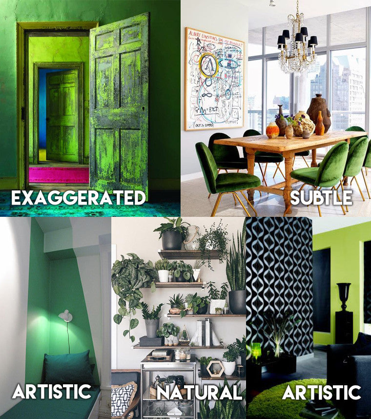
EXPECTED TREND - Bright GreenNot just green, and not dark green, lime, jade, or emerald green. BRIGHT green. “THE PANTONE 2017 COLOUR OF THE YEAR IS THE WORLD’S BRIGHTEST NEUTRAL” Why Green?This uncommon colour evokes imagery of natural greenery. Studies have shown that people seek out nature in times of stress, as its characteristic ‘soft fascination’ induces a sense of relaxation, rejuvenation and reflection. There is no better way to expose yourself to such positive characteristics than incorporating these features into your home. Although bright green shaded walls are predicted to hop on the trend train in 2017, not everyone is up for the exaggerated, possibly eccentric design ideas some designers might have in mind. If this kind drastic change is too much to handle, there are always simple but artistic, or very subtle ways to incorporate greenery into your home.
COMMON TREND - Wall Decals
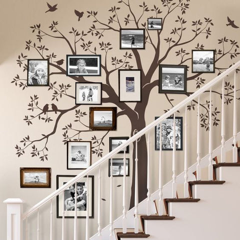 For those who haven’t noticed, wall decals have become increasingly popular all around the world and is predicted to become all the rage in 2017 as creative simplicity overrides large surfaced wallpapers. So if permanent designs scare you and design commitments is on your list of phobias then this is for you. For those who haven’t noticed, wall decals have become increasingly popular all around the world and is predicted to become all the rage in 2017 as creative simplicity overrides large surfaced wallpapers. So if permanent designs scare you and design commitments is on your list of phobias then this is for you.It allows your creativity to be reflected on the very skin of your home. If you think of the anatomy of your home as the structures being the skull, the roofing being your hair, the walls being your skin, the rooms as the sections in your brain, with windows to brighten up your mind, then the furnishings are merely a reflection of the creativity the right side of your brain produces. Just as your mind is forever changing and evolving, so are wall decals. The possibilities are limitless and the designs can only be restricted by your own mind. On more technical terms, wall decals most exemplary features is as follows; it’s a simple DIY project from beginning to end; it’s versatile in design; there is no risk of permanence as it is easily applied and removed at the whim of your creativity. In comparison, wallpapers can be quite expensive and it doesn't leave room for quick and easy DIY application and removal. Especially for those who live in apartments, are renting or living in any form of housing that limits the amount of renovation you can do to the walls, then this is the perfect opportunity to liven up your home with zero damage and permanence. A small word of advice. Just as with wallpaper or paint, please be aware of quality when searching for your wall decal. Make purchases based on quality and reviews rather than low-cost. Focusing on economic possibilities is not worth the risk. A large scaled design with horrible manufacturing quality could potentially leave an unwanted marking or peel on your wall which will be devastating when you wish to renovate or refurbish. Recommendations: Fixate, Fab, Gilt UNEXPECTED TREND – Industrialised Homes From Preserved Abandonments
from https://www.wallvision.com.au/blogs/news/3-interesting-interior-design-trends-predicted-for-2017 As your family prepares to welcome a new person in the world, it's always a surprise if you don’t know the gender of the baby. However, this brings another headache, when you are trying to prepare for the baby, since you don’t know the colours to include in the nursery. The good news is that you can work with neutral colour schemes, to give this room a special effect, which will last as your bundle of joy grows and matures. In addition, a gender-neutral colour scheme can be a calm and positive environment, for your newest family member. It is also an enjoyable environment. Here are several ideas that you can creatively explore and implement. Colour FavouritesAs you start working with colours, choose a colour that you love or a favourite of your partner’s. They can be your favourite sports team colours, or even a combination of your favourite colours or colours that you love combining. If you come up with colours that you love, you will spread positive energy in your child’s room. Monochromatic Colour SchemesIs there a certain colour that you love most? If that is the case, then you can work with it, and come up with an amazing scheme for the room. Just apply a monochromatic colour scheme, and let the design settle. You can then come back later to apply some matching. Monochromatic colours refer to tones, shades or tints of a single colour. For example, if you choose purple, you just need to add small quantities of white, to obtain a shade. You can then add black to your base colour, to ensure all the colours in the room maintain the same colour scheme. Neutrals
Complementary ColoursPeople have different tastes especially when it comes to colours. It is quite hard to come across a couple with similar colour tastes. However, that brings another interesting design angle. You created this bundle of joy, as you brought together two families. You can use that aspect to work with complementary colours. Using a complementary colour scheme, you can easily convey a symbolic or metaphoric relationship in the baby’s nursery. In fact, your bundle of joy will find the environment very relaxing, whether it is boy or girl. Colours such as orange, blue, purple, red, green or yellow, are gender neutral. You just need to obtain a colour wheel from the art store or paint store, spin it, and you will definitely obtain a gender-neutral combination, which brightens your little one’s room. Tricolour Palettes
Whichever shade you chose to work with, it is advisable to avoid a themed nursery using a wallpaper border or a cartoon character. Most children outgrow such designs quite fast. Instead, use a design that incorporates timeless style in the nursery room. Stick with subtle looks. If you choose a mural, go for a design that incorporates nature, such as a tree painted in white, laid on a neutral wall. Such a look will always be timeless for any child, even as he or she grows into grade school. Final ThoughtsWhen it comes to designing your baby’s room, get creative and colourful, with a wide range of gender-neutral colour schemes. As you can see, the options are endless, and you can work with any combination that you and your partner love. You don’t have to follow what everyone else is saying, just choose something that your family will enjoy. Savefrom https://www.wallvision.com.au/blogs/news/gender-neutral-nursery-colour-schemes Choosing PaintPicking out decals is easy since all you have to do is look for a design that suits you the best. There are a lot of pretty options out there, so you’re bound to find a few you’ll fall in love with! While picking out designs is fun, another thing to think about would be the kind of paint you’d be sticking the decals onto. There are so many options of paint on the market that it can get confusing to decide which one would be best for your living space, especially if you plan on putting decals on your walls. If you’d like to rid yourself of a few of your paint problems, read on! Make Sure Your Walls Are FlatOne of the most important things to take into consideration is that your wall is as flat as possible. Textured walls make it difficult to stick decals on, as they should ideally be going on perfectly flat surfaces to reduce lumps and bumps. The more textured your wall is, the less likely it is that your wall decals are going to stick properly, if at all. Get your walls professionally evened out so that you won’t have to run into this problem. After ensuring that your walls are nice and flat, be sure they’re non-porous and clean as well. This will make adhesion simple. Check the Kind of Paint You’ll Be Using
After Painting the Wall…After you’ve gotten your wall painted, the most difficult thing to do would be to wait for your paint to cure for at least 3 weeks before sticking anything onto it. This lets the paint settle into the drywall. While you don’t have to wait three weeks, just note that the sooner you put the decals on, the more likely it is that the adhesion won’t work very well. Not only that, but the decals might even cause damage to the wall when you eventually remove them. Just give the paint an ample time to cure and things should be A-OK! Other Things to NoteIt’s best to avoid paint that has anti-graffiti agents or stain blockers. The reason for this is that they won’t let much stick onto the paint, as that’s what they’re designed to do. Regardless of which type of finish you choose for your wall, it’s important to squeegee the decal onto the wall the best that you can. Also, don’t forget to remove the transfer paper at a 180-degree angle (ie: folding the tape back over itself when peeling). We hope that this guide has helped you out with your paint troubles! Just get everything in place and get ready for pretty walls that are sure to turn heads! Savefrom https://www.wallvision.com.au/blogs/news/how-do-i-choose-the-best-paint-for-my-walls When it comes to styling a house, it’s amazing how simple it can be to turn your house from something ordinary into a warm, inviting and equally stylish space. Storage and BinsThe first rule is remove clutter from eyesight, to create the illusion of space. In today’s market most houses are smaller than what we are traditionally used to, so if you are sacrificing space for style, clean lines are key. Storing things like children’s toys in metallic wire baskets is a great way to save space as well as give your home a modern look. Earthy tones and textures are also on trend at the moment so look for wicker boxes or baskets to place things like books, magazines or remote controllers in rather than leaving them lying on counter or table tops. Vases and Trays
Wall DecorThis year has seen the trend of wooden hanging wall decor, mirrors and bookshelf's etc, the rule is opposite to the previous one if you have a number of curved lines in your house then choose rectangular wall decor and if you have a lot of square or rectangular lines chose circular wall hangings for you rooms. Colour SchemesThe next thing to focus on is colour schemes; the idea is to create a colour scheme that lifts the room without over matching or in some cases over miss-matching items. The rule is if you have dark floors, i.e. polished hardwoods floors, choose a wall colour and accessories that will not only make your room look brighter but also give the illusion that the space in larger than it is. So why not look at a cream or light grey wall colour with a mustard rug and mustard pillows to bring brightness and warmth to the room. If you have a light coloured carpeted room you could look at the stone style wallpaper with black leather recliner to give that air of elegance and entertainment. Wall Decals and StickersWall decals are an easy way to bring some life to the kid's bedrooms. Avoid character wall decals if possible as they can very quickly date a room which is not what you want. So instead look for things like polka dots and other pattern stickers, woodland creatures, butterflies or trees to stick onto pale or pastel coloured walls, to once again create the impression of space, while creating an age appropriate paradise for your little one. For the grown up bedrooms there is only one rule - there are no rules, don't be afraid to experiment with colours, shapes, and decor, this is the room to choose a strong wallpaper or colour to make a statement, because at the end of the day it's your room so make it your own. BathroomAs for as bathroom, choose bright coloured accents like aqua or turquoise towels and rugs, choose a fresh scented diffuser and finished with wood texture accessories like bins and toilet brush holders. At the end of the day styling your house does not need to cost and arm and a leg, a few minor adjustments can completely transform your home. Happy Styling! from https://www.wallvision.com.au/blogs/news/simple-decorating-tips-that-add-style-to-your-space With house prices around the country hitting record highs, many tenants are facing the dilemma of how to decorate and design while staying within the constraints of their tenancy agreement. With so many insta-worthy ideas flowing through our news feeds on a daily basis, what is a poor tenant to do without violating their lease? Fear not! there are many ways that you can jazz up your standard white walls that are entirely changeable with your mood and the season, without breaking the bank or raising the ire of your landlord. With the rise of ‘shelfies’ online, many people are looking to the humble shelf as a way to add some extra decoration to their rooms. Popular designs utilise a simple floating shelf, quite often in neutral colours to adorn with a variety of small homewares. Not only is this an easy way to create a style that looks effortlessly chic, it gives you a place to store all the little knick knacks and mementoes that you collect day to day. Nostalgic books, candles and photo frames are common items found in this style and can be picked up cheaply from retailers such as Kmart. Indoor greenery and succulents (for the novice green thumb and hardy enough to withstand the most infamous plant killers) can be planted in colourful pots to bring an on-trend and inexpensive pop of greenery to your room. For inspiration check out #shelfie and #shelfiesunday to scope out how some seriously drool-worthy designers have worked their shelfie magic. To bring some light to your space, hanging mirrors can help bounce the natural light from windows and doors around the whole room. Play with different frames and styles of mirror to see what suits the shape and style of your room, with ornate brass frames and minimalist sleek panels both bringing a touch of class. For a more creative use of mirrors, arrange a variety of small mirrors in a pattern around the walls. Combining different styles, sizes and frames will create an eclectic and ‘thrown together’ vibe and can easily be picked up from your local second-hand shops. from https://www.wallvision.com.au/blogs/news/easy-ways-to-bring-your-walls-to-life Say goodbye to oversized furniture, antiques and brass, 2017 signifies a year full of marble, bright colours and coarse wood! There were so many trends in 2016 that just aren't going to make the cut in 2017. Throw out all your oversized furniture as space is going to be valued a lot more in 2017. Using oversized furniture will not only limit the space which is available to you but it will also create the illusion that you have a much more cramped and closed in space. Another big no-no in 2017 is too much brass. Brass was very big in 2016 as it created a rustic look although, according to ‘My Domaine’ brass might come off tacky in your home if overdone which is certainly not something that you want in 2017. Matte Appliances
A great 2017 trend you could use to make your home appear more modern are matte appliances, especially in the kitchen. Matte appliances will spice up your kitchen as they are a completely different finish to the glossy finishes we're used to up until now. Matte appliances will give your home a modern, edgy and fascinating look. Smart Home Furnishings
We all know that voice-activated assistants have been raved on about on social media and the massive convenience they are, so why not invest in one? One of the most popular voice-activated assistants is Amazon’s Alexa which is voice activated and responds to ‘alexa’ or ‘ok google.’ Ask it to play a song, turn down the lights, give you the weather forecast and so much more! ColoursEarthy tones such as mauve, terracotta, cinnamon and olive green are making a big comeback in 2017. Their subtle tones are much desired in 2017 as they add a great touch to any room! They're also incredibly versatile, allowing you to either go bold or stay subtle, achieving the very popular ‘minimalist’ look.
Green is also said to be incredibly popular in 2017. By placing green in your house, you will no doubt be turning heads. Whether this is a subtle green such as small green furnishings or bold such as painting all your walls green, you will be right on trend! A Grand Entrance
2017 will be a great year for interior design and you can get on top of all the trends early if you follow the few tips we have given you! Got some predictions of your own? We'd love to hear them! from https://www.wallvision.com.au/blogs/news/new-home-decor-trends-you-need-in-2017 |
About UsWallVision is here to bring you the wall of your dreams! Bold designs and beautiful, vibrant colours are what we are known for. What you may not know about us is the removable ability of our wall decals! Now you can play with your design for months on end until you get it just right. WallVision is the smart choice for anybody looking to incorporate some breathtaking wall decor into their space. Whether you're styling your own home, sprucing up a rental, or bringing some colour to the office, our low prices and the ability to reuse your decals wherever your heart desires makes them the easiest decor decision of any creative project. Archives
December 2017
Categories |
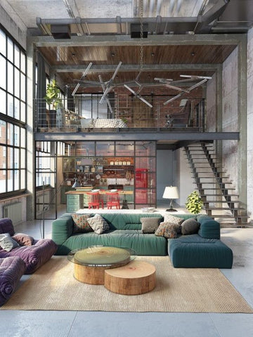 The industrial look has become increasingly popular in the design industry. Since about 2011-2012 after the cosy cottage style houses began to smoulder out, there has been a rise in designs utilising materials such as reinforced glass, copper, marble, limestone, exposed bricks and stones within commercial as well as residential settings. From the days of hoarding, of over decorating, with photo frames on the fireplace and along the staircase, interior designers and architects are reverting back to the words of Mies Van der Rohe; “Less is More.”
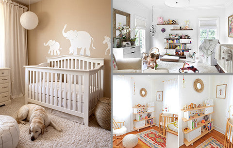 Most people will tell you that brown, beige, tan or grey colours are boring, and they should not be included in a room. Some people swear by cream or a shade of yellow, as the most appropriate colour a room. However, it is all about experimentation. The truth is, soft hues, when properly applied, can create one of the most calming environments, for your little one. Storm grey, khaki, sand shades and grass shades, are gender-neutral colours, which are highly relaxing. With such colours, you can create a relaxing oasis for your baby and you.
 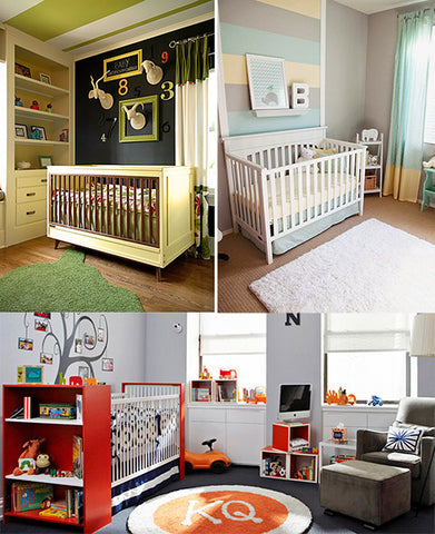 If you feel like monochromatic or complementary colours are not your thing, then you can work with tricolour palettes. As your add more colours, your nursery becomes more gender-inclusive. There are numerous paint selling or colour matching stores online, which allow you to play around with colour schemes, by simply dragging and dropping together the colours that you love, and then checking how they appear together. This way, you can easily try them out, before making a buying decision.
 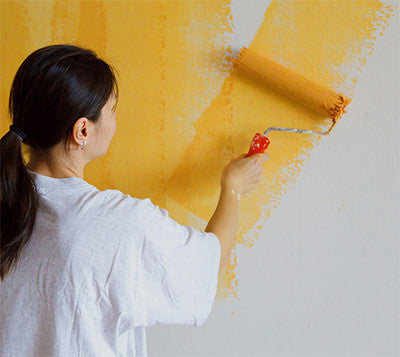 Choosing the best paint simply means knowing what you’re looking for. It’s good to make sure that the colour you’re choosing for the walls will be matching your pretty, new decals! That aside, pick out your paint in a gloss or semi-gloss finish, since this is the best kind of surface the decal will adhere to. While you would still be able to use a satin or eggshell finish, it would be more difficult to apply the decals. Surfaces with a matte finish will make application and adhesion more difficult, but don’t fret too much, since it’s not impossible, either.
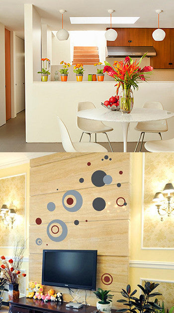 Fruit baskets are a thing of the past, so ditch the fruit baskets and instead highlight your dining table with a metallic tray in the centre and a medium sized vase which can be filled with real or fake flowers depending on your preference. If you have a square or rectangle table chose a vase that is square or rectangle. If your table is round, look for a more curved style of vase, avoiding fishbowl style as you want to draw the attention up and away from the table and fishbowl vases are too low to accomplish that.
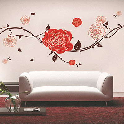 Big, bold prints are always a go-to for a show stopping centrepiece and these can be easily bought online. For an affordable and lightweight option, removable wall decals are readily available in a wide range of prints, patterns and images. Look for something that suits the theme of your room or go for something trendy to match your mood. Our range of wall stickers stick to most wall surfaces easily and won't leave any permanent damage. The size of your decal depends on the size of your wall and the desired impact. For a personal touch, custom printing a photograph you have taken yourself will give you a completely unique centrepiece for your room.If you're thinking about jazzing up the kid's room, be sure to check out our nursery decals!
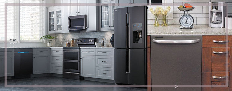
 Another great 2017 trend is smart home furnishings. Having these furnishings will not only make your life a hundred times easier, it will also greatly help making your house appear incredibly modern. Some examples of smart furnishings are tables with built-in charging docks or voice-activated assistants.
 Another way you could bring your house up to date with the latest 2017 trends is by going all out on your entryway! The entry to your house is the first and last thing that a guest will see so it's important to make a good impression. Something as simple as adding nice artwork or a grand mirror to your entrance could change the whole vibe of your house. We'd obviously recommend some classy wall decals like those in our
  RSS Feed
